Article Contributed By David Gruttadaurio
You spend a considerable amount of time and money producing your monthly client print newsletter. Having it tossed in the trash along with the ‘B’ pile (junk) mail is the last thing you want.
Yet this happens every day to small business owners just like you. In fact, it’s probably happening to you right now.
Why? Because most monthly client print newsletters are not put together in a way that screams out “READ ME!”
Having Great Content is Just the Beginning
Ignoring your newsletter’s ‘packaging’ or formatting is like giving your clients a lovely gift… and then wrapping it with duct tape and plain brown paper. The fascinating articles and interesting content in your newsletter must be presented in an appealing way to capture the eye’s attention.
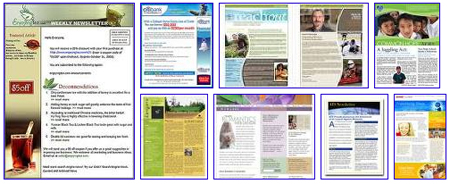
By following seven basic newsletter design rules you will ensure that your client print newsletter does not wind up in the trash.
7 Tips to Get Your Newsletter Opened and Read
1. Color attracts the eye. The only people who tell you color isn’t important are the ones who refuse to use it. USA Today is one of the most popular newspapers in the world is – primarily because of its extensive use of color. Why? Because color animates everything! It livens up and attracts attention.
2. Use interesting formatting. Put your copy in a tinted text box. Use reverse text (white text on a black background) somewhere in your newsletter. Also use a multi-column format. With the proper use of shading, reverse text borders and bold fonts, you can design a professional newsletter template that grabs attention.
3. Don’t go crazy with fonts. Stick to a maximum of three font types throughout your newsletter.
4. Headlines get noticed. Decades of newspaper reading have taught us to look for headlines. We look for them to get an idea of what to read. We scan the subheads to pick up on the key points. Powerful, punchy headlines get noticed and read.
5. Make your lead article interesting. This is critical. If the main article is boring (or sounds boring)… you can forget it. You’ve lost their attention and you won’t get it back. Your customer or patient will simply stop reading your newsletter.
6. Position draws the eye. Without anything else to draw it, the eye comes to rest about two thirds of the way up the page and slightly to the left. That’s a good place to put something interesting. Think picture or graphic.
7. Use pictures and graphics liberally. Everyone loves pictures. And they really are worth a thousand words because they capture our attention. That’s why the captions on photographs are the most-read parts of ANY publication.
Hint: Use the “dollar bill” test. You shouldn’t be able to lay a dollar bill down on your page without it touching a graphical element.
The Bottom Line
A successful client or patient newsletter is controlled by more than just good content. Your newsletter template design must be pleasing and attractive to the eye.
You can learn more about effective print newsletter design by going to our website at www.newslettersmadeforyou.com to see how the Exceptional Living newsletter uses each of these formatting steps in its template design.
Remember: A client newsletter is a powerful relationship marketing tool. When you follow a successful template, your newsletters will be well received. It will provide your customer with an interesting and fun experience. And, it will ensure that your monthly client print newsletters get opened and read every time.
About the Author:
When Print Newsletter Marketing Expert David Gruttadaurio discovered the power of publishing and distributing a monthly print newsletter to attract and retain clients, he instantly tripled the sales of his service business. Now, he is revealing his bullet-proof plan to survive the new, emerging economy at his Profit Exploding Newsletter Secrets Website: http://www.NewslettersMadeForYou.com
Categories